15 second bumper!
Posted on: April 19, 2010
My first attempt in after effects!
Vector/Sculpey/Flash Logo
Posted on: April 29, 2009
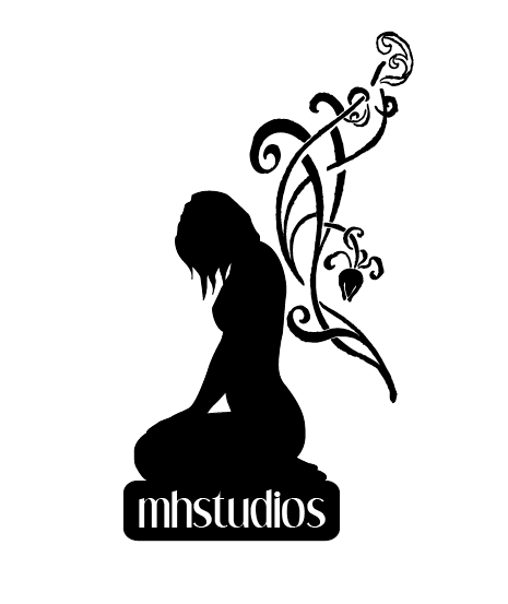
This is a logo I created for myself in the beginning. We were asked to create a figure or element based on something that best represented ourself, which to me, is a butterfly. I think of butterflies likes humans, all though they only change once, I feel they reflect the human side of beauty, because we are all beautiful in out own way.
So, I then took a picture of myself and put it into Illustrator and traced it and created wings for the fairy like appearance. I then took the image as reference and made it into a 3-d model made out of sculpey (clay) and baked it. Below is the slideshow of this process.
 |
| Make a Smilebox slideshow |
Domestic Violence Magazine
Posted on: April 22, 2009
Above: Cover for Domestic Violence Awareness Magazine
Above: Full page advertisement for Domestic Violence Hotline
Above: “Kohls Cares for Kids” – Full page advertisement
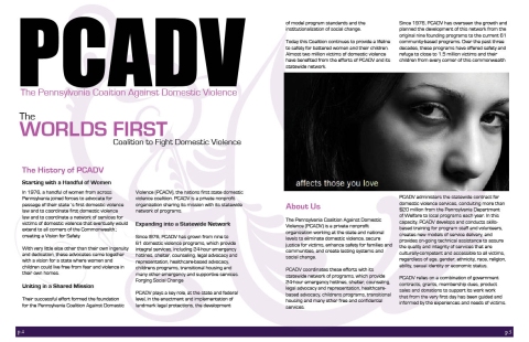
Above: Two page layout for magazine

This is a magazine I created for Domestic Violence Awareness. During my Bachelor of Arts at Penn State University, I interned for the PA Coalition Against Domestic Violence in Harrisburg, PA. While I spent my year there, I learned and saw so many horrific stories and images. Prior to this experience, I did not realize the impact of dometic violence on our world and decided to make this magazine to promote it’s seriousness and hopefully inspire others to fight for the cause.
All designs were created in Adobe InDesign, Illustrator and Photoshop. No images were altered for effects and All advertisements and magazine layout was created by me. I obtained the images from various website and the copy from http://www.pcadv.org
Devil Springs Movie Poster
Posted on: April 21, 2009
This is a movie poster that I created in Photoshop. I took a picture of a local park in Orlando, FL called “Wekiwa Springs” and later decided to turn that picture into a Horror Movie. I also created the font from a font that I ad found on dafont.com. I wanted to make it took creepier, so I decided to warp their edges.
Necco Sweethearts
Posted on: April 20, 2009
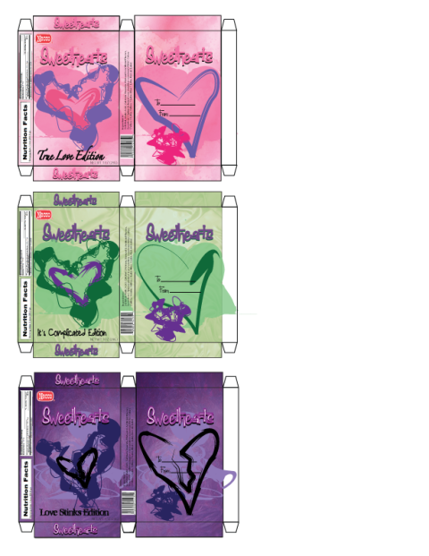
Usually when Valentine’s Day approaches, I tend to feel uneasy and quite shaken up. The thing is, I have only ever had two valentines in my life and feel that maybe this holiday was made up by some evil power to shed the confidence of those who are single. Luckily, I am a graphic designer and had the idea turn the traditional NECCO Sweethearts into an enjoyable treat for all people on Valentine’s Day.
The idea is that these would come out each Valentine’s Day as part of a series. The True Love Edition would be whole hearts with sweet sayings., the It’s Complicated Edition would be heart pieces and the Love Stinks Edition, would be broken hearts.
Typography Project3
Posted on: October 8, 2008
7/31/08
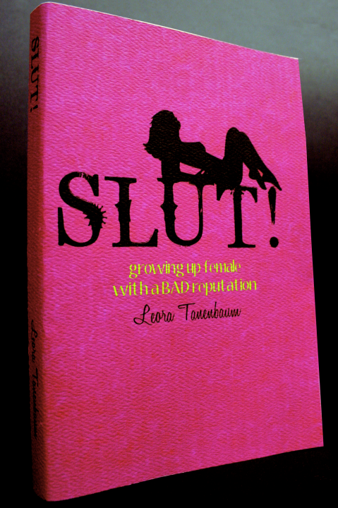
This was my redesign of the book called “SLUT”. I read this book when I took a feminism class at Penn State, where I received my bachelor. I didn’t like the original design too much nor their own redesign of the book cover. So, I decided to pick this book to redesign.
I created the background in Photoshop and laid the text and the images and the background in Illustrator. This is by far my favorite design up to this point. This really didn’t take me that long, once I found my idea, I went with it and ended up completing it in only a few hours. It does take some time to find the right placement for the text and then lining all other text on the page.
I really liked our typography class. I learned a lot about type and how powerful it is in this world. I also realized, through this project, that I really enjoy working in Illustrator.
Typography Project2
Posted on: October 8, 2008
10/8/08
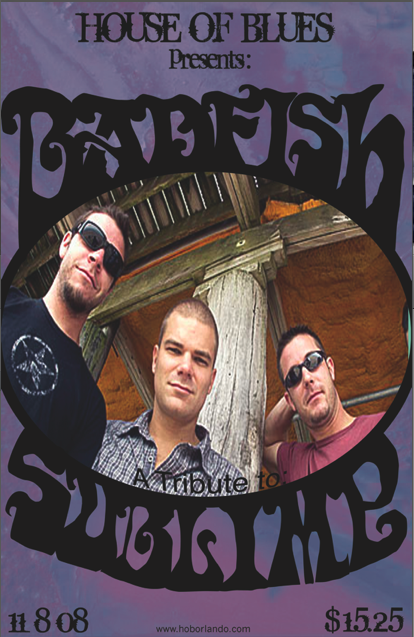
I created this using Photoshop and Illustrator. Our assignment was to pick an event and design a poster for it. I chose the upcomin event of Basfish, a tribute to Sublime. The trick with this project was that you had to create your own font for at least one part of the poster. I chose a font, to begin with, expanded it to view it’s points and began manipulating the text around an oval, where I knew I wanted to place a picture. By the time I was done, the text ended up not looking much like the original. I actually revamped this the other day and probably will again; however, I do like the current design.
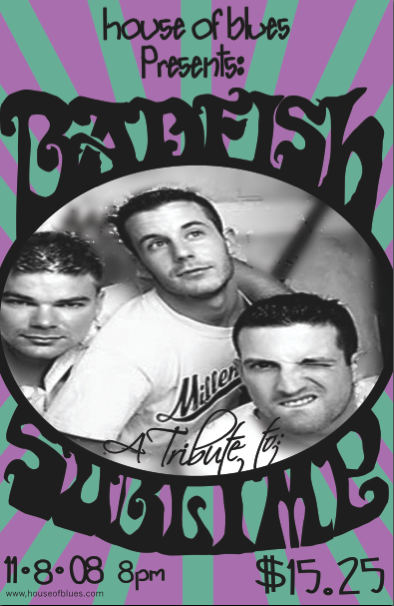
Below is the original design. Hope you like the new one better, because I definately find it more attractive.
7/21/08
